

The Brief
Hanna Andersson is known for their high quality clothing & bedding. The baby division was identified as major opportunity for growth. Insights gathered from an outside consulting firm showed the customers’ appetite for a baby registry experience with Hanna. We were tasked with creating an emotive & engaging experience that was simple and intuitive.
Research
To start off, the UX team met with key stakeholders to fully understand their vision for the registry and performed market research to identify what users expected from a registry. Throughout the process, we built wireframes and prototypes with InVision to perform limited usability testing. At the time, we did not have budget for full testing, so we relied on family, friends, and co-workers ensure the solution was customer centered.
Challenges
Hanna’s product cycles seasonally and has few evergreen products. Customers typically register up to 6 months before their due date. With this combination of factors, the likelihood of products in their registry being sold out was very high. A business decision was made for the experience to be a microsite which would show an increased offering of evergreen products and a limited selection of seasonal items.
Wireframes
Once the user flows had been defined, the UX team built out wireframes. We used these wireframes to create clickable prototypes in InVision. Below is a sampling.


Key Pages in the Customer Journey
Landing Page
This page is the gateway for users to create a registry. It leverages emotive photography & quality storytelling to get the customer excited about creating their registry.

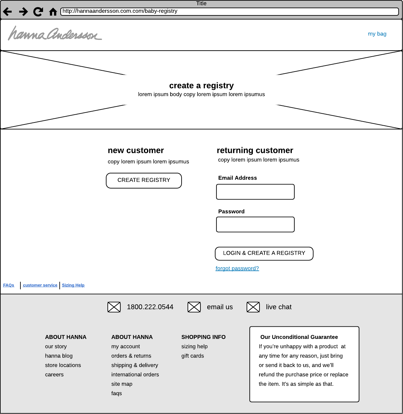
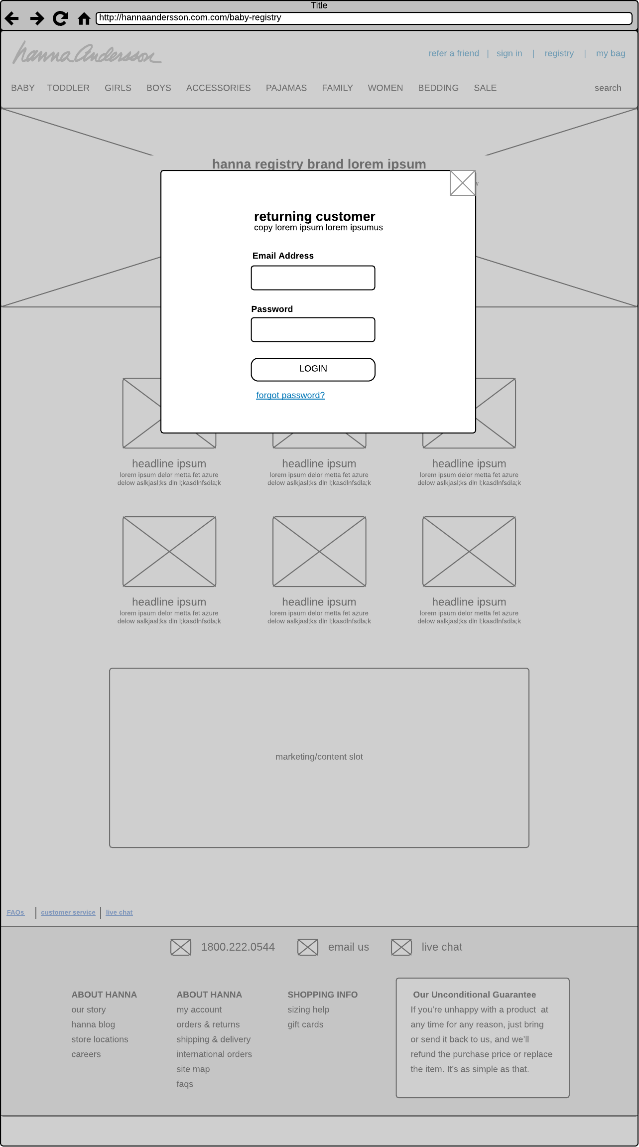
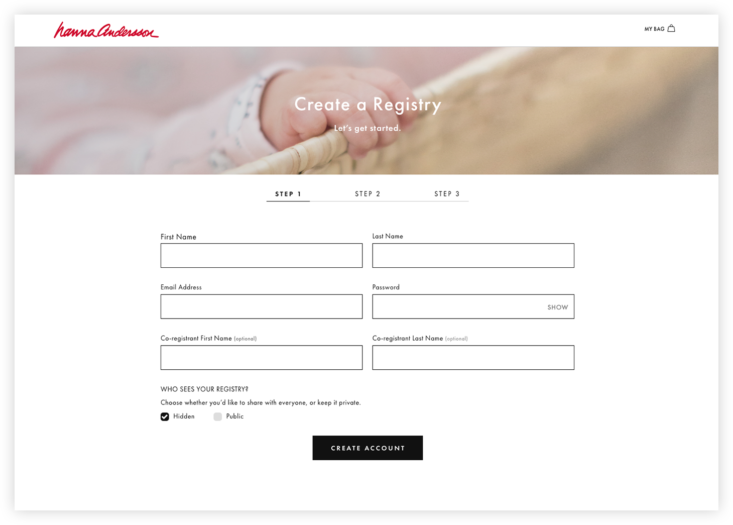
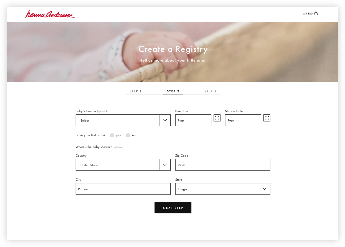
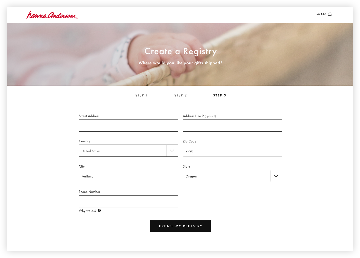
Registry Sign-up
Creating a registry requires a lot of information from the user. To increase completion rate, we streamlined the process into 3 steps.
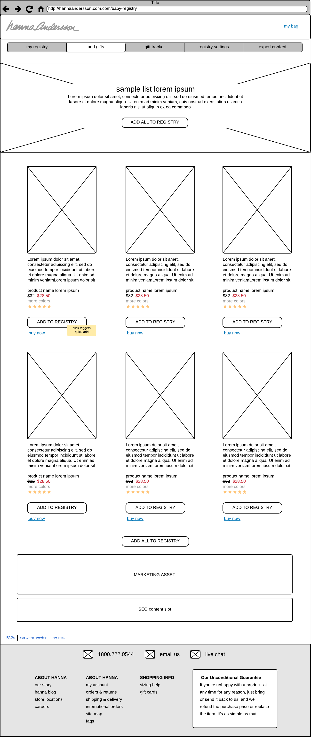
Add Gifts Landing Page
Once the user creates their registry, they are landed on a page that displays a personalized header at the top and gift suggestions below to get them started in building their registry. The landing page consists of featured collections, trending products, and top categories.

Product Landing Page
We added product story-telling by interweaving marketing tiles though the product grid. These tiles highlight features of the products, customer reviews, and emotive photography to convey the quality of the product.


Expanded Product Tile
To streamline the process for adding items to the registry, we developed an expanded product tile so the user can stay on the product grid.
This is a simple 2 step process that begins when the user hovers over the product tile. Once the they click the button, they are prompted to select a size which is then added to their registry.
Gift Tracker
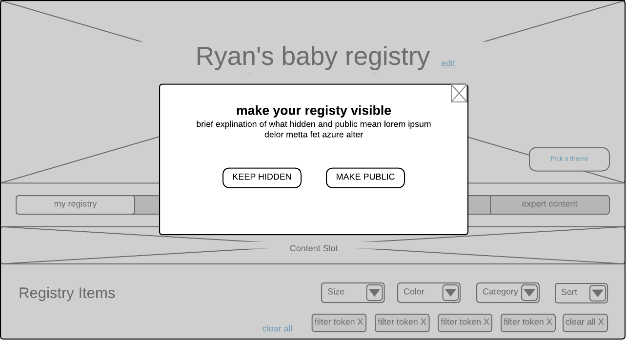
Settings


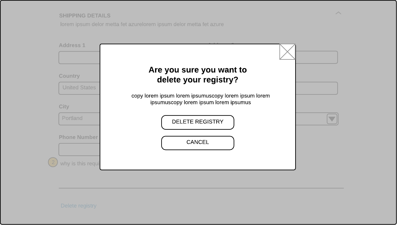
My Registry Page
When a user has created a registry, it is a curated list of items that they love. They have spent time looking though the site to find just want they want for their new baby. Most registry pages show this list as a small thumbnail of product which is not very engaging. We also saw that users would often edit quantities and colors multiple times which would require loading a Product Detail Page.
We set our registry apart by making the product images the main focal point and allowing the user to edit the products by using the expanded product tile function.